
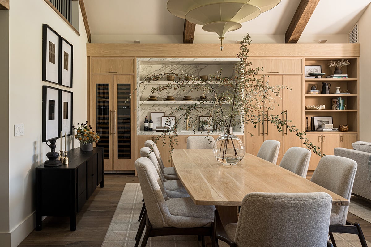
Shelf Styling Ideas: A Designer’s Guide to Open Shelving
By Interior Designer TRACY SVENDSEN | Published on May 04, 2022 | Updated on September 11, 2026 |
Shelves are one of the most underestimated surfaces in a home — they’re functional by necessity but genuinely expressive by choice, and the difference between a shelf that reads as an afterthought and one that reads as a considered design decision usually comes down to a handful of principles rather than any particular object or style.
As an interior designer, I approach shelf styling the same way I approach any other design problem: starting with the architecture and working inward. The shelving itself — its material, profile, and relationship to the surrounding wall — sets the parameters for everything that goes on it. Get that right, and the styling follows naturally. Rush to the objects without considering the structure, and even the most carefully chosen pieces will feel unsettled. The same principles that apply to living room and bedroom shelving translate directly to kitchen pantry organization — the structure and logic are identical even when the objects change.
This guide covers the full range of shelf styling decisions — from the initial choice of shelving type to the specific techniques for arranging objects with genuine visual confidence. I’ll also be including a section on my own current project: a feature wall redesign in our home that’s been one of the most personally satisfying design decisions I’ve made in years. We plan to source and incorporate custom live-edge shelving locally to enhance the fireplace design and reflect the sculptural live-edge dining table in our open-concept space. Feature image courtesy of Sarah Liz Lawson.
Key Takeaways: Shelf Styling Ideas
- Choose the shelving material and profile before buying a single object — the structure sets the visual tone for everything that goes on it.
- The wall behind your shelving matters as much as the objects on it — a neutral backdrop lets busier displays breathe, while a patterned or colorful wall calls for restraint.
- Layer at least three or four material types (ceramic, wood, natural fiber, a living plant) and leave roughly a third of each shelf empty rather than filling it edge to edge.
- Apply the triangle rule (tallest at the back, smallest at the front) and group similar objects in odd numbers for a display that reads as considered rather than assembled.
- The most compelling shelves include genuinely personal objects — travel finds, inherited pieces, items collected over years — not just purchased decor.

Custom White Oak Built-In Cabinetry with Open Shelving and a Reeded Detail
Image courtesy of Lindye Galloway Design
1. Start with the Right Shelving for Your Space
The shelving choice is the most consequential decision in the entire process — everything that goes on the shelves is shaped by the material, profile, and scale of the structure itself. Built-in shelving suits traditional and transitional spaces where a sense of permanence and architectural integration is the goal. Floating shelves suit modern and minimalist interiors where the wall itself is part of the composition. Live-edge and sculpted-profile shelves suit modern organic and Scandinavian spaces where the connection between natural materials and clean architecture is the design intention.
This modern organic living room shows built-in open shelving used with real material intelligence. White built-in shelving above the TV and fireplace base cabinets is styled entirely within the room’s existing black, white, and warm wood palette — sculptural branches, wood chain links, black and white books and pottery, and wood candle holders creating a display that feels like a natural extension of the room rather than a separately decorated surface. The high ceilings, white walls, light wood flooring, leather accent chairs, and black vases throughout establish the high-contrast modern organic palette that the shelving styling simply continues.
Designer Tip: I always recommend deciding on the shelving material and profile before purchasing a single object to style it with — the shelving sets the visual tone that every subsequent styling decision either supports or contradicts. A live edge shelf calls for organic, sculptural objects. A sleek white floating shelf calls for cleaner, more minimal pieces. The mismatch between shelf and object character is the most common shelf-styling mistake I see.
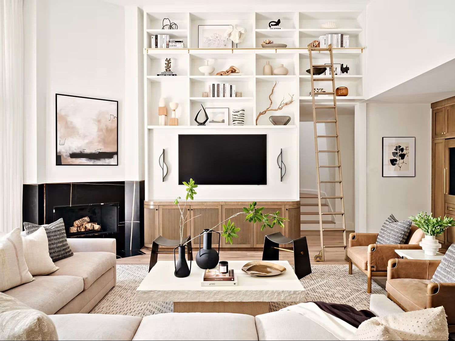
Open Shelving Above the TV in a Modern Organic Living Room
Image courtesy of Fire Finish Interiors
2. Layer Objects for Warmth, Depth and Texture
The most compelling shelf displays aren’t built from a single category of object — they’re built from a deliberate layering of different materials, heights, and textures that create visual depth across the shelf surface. Woven and natural fiber pieces alongside ceramics, stoneware, artwork, and living plants create the tonal variation that makes a display feel genuinely considered rather than simply filled.
This kitchen open shelving between two upper taupe cabinets shows layering done with real material confidence. A vertical cream shiplap accent wall behind the shelving adds architectural texture that elevates the display before a single object is placed. Woven and wood baskets, rustic pottery, stoneware, cookbooks, artwork, and potted plants layer across the shelf in warm earth tones — the variety of materials creating depth while the consistent warm palette holds everything together. Chrome pendant lights above the top shelf add the functional and decorative finishing element that connects the shelving to the kitchen’s broader material story.
Designer Tip: I recommend building every shelf display around at least four distinct material types — ceramic, natural fiber, wood, and a living element. Four materials within a single tonal palette create the layered, collected quality that makes a display feel genuinely rich rather than busy.

Open Shelving in a Kitchen with Taupe Cabinets and Shiplap Walls
Image courtesy of Homes & Gardens (Jan Baldwin)
3. Carry the Shelf Palette Throughout the Room
The most cohesive interiors treat shelf styling not as an isolated decorating project but as part of a room-wide material and color story — the same objects, tones, and textures that appear on the shelves reappear on the coffee table, the console, and the surfaces throughout the space.
This farmhouse living room clearly illustrates that principle. Arched built-in shelving on either side of the white fireplace is styled with leaning artwork, large rustic wood pots, potted plants in white vases, and stacked books — a natural, organic display with exactly the right balance between filled and breathing. The large woven circular tray on the round stone coffee table features the same material palette: a white pot with a plant, stacked books, and a wooden bowl. The shelf display and the coffee table display are the same composition at different scales, which is what creates the room’s cohesive, considered quality. Vaulted ceilings with wood beams above connect the natural wood material throughout from floor to ceiling.
Designer Tip: I recommend choosing two or three objects that appear on your shelves — a specific vase shape, a book stack, a small plant — and repeating them on the coffee table, console, or dining table in the same room. The repetition of the same elements across multiple surfaces at different heights creates a cohesive interior that feels genuinely designed rather than room-by-room.

Styling Arched Shelving Framing Fireplace in a Modern Farmhouse Living Room
Image courtesy of Pure Salt Interiors
4. Why the Background Makes or Breaks a Shelf Display
The wall behind your shelving is doing as much visual work as the objects on it — possibly more. A neutral, receding backdrop allows every object to read clearly and independently, which suits displays with strong individual pieces that deserve attention on their own terms. When the background disappears, the objects become the entire visual story.
These two images of the same living room show that principle working at its most resolved. White walls and whitewashed brick behind light wood framed open shelving create a quiet, neutral backdrop that allows the display to breathe — white and wood bookends, black and white artwork, wood bowls and vases, brass sculptural pieces, and large wicker baskets at the base reading with complete clarity against the pale surfaces behind them. Nothing competes with anything else. The living room’s wood furniture with white upholstery, light wood flooring, and black-framed windows establishes the same restrained palette throughout — the shelving an extension of the room rather than a separate decorative moment.
Designer Tip: I always assess the wall behind shelving before choosing a single object to place on them — if the wall is already doing visual work through texture, color, or pattern, the objects need to be more restrained. If the wall is neutral, the objects can carry more variety. The relationship between backdrop and display is the conversation that determines everything else.


Open Wood Shelving with Vases, Artwork, Plants, Sculptures & Wicker Baskets
Images courtesy of Studio McGee
5. Use the Wall Behind the Shelves as a Design Element
When the backdrop becomes a deliberate design choice rather than a neutral surface, the entire character of the shelf display shifts — the wall and the objects work together as a single composition rather than background and foreground. This approach suits more restrained styling where a few carefully chosen pieces are supported by a dramatic surface rather than a busy arrangement of objects carrying a quiet wall.
This built-in cabinet shows exactly what happens when the backdrop is treated as the most important design decision in the shelving composition. Dark olive green base cabinets with matching open shelving and countertops above create a strong architectural foundation, while dramatically veined white marble with black and gray veining behind the open shelving elevates the entire display to something genuinely luxurious. The marble panel does more visual work than any single object on the shelf — it’s the element that makes the space feel high-end before a single piece of artwork or pottery is considered. Against that backdrop, brass-framed artwork, black and white sculptural objects, woven baskets, pottery, plants, and books read with the clarity and confidence that only a considered backdrop can provide. A sculptural black, white, and brass light fixture in front completes the composition — the metallic detail connecting the shelving display to the room’s material palette on light wood flooring throughout.
Designer Tip: I recommend considering marble, shiplap, grasscloth wallpaper, or a deeply saturated paint color behind open shelving before defaulting to a neutral wall — the backdrop choice fundamentally changes the character of the display and should be decided before a single object is purchased. A neutral wall suits displays where the objects carry the visual weight; a statement backdrop suits displays where restraint and material quality do the work instead. Neither is inherently better — they’re simply different design intentions.
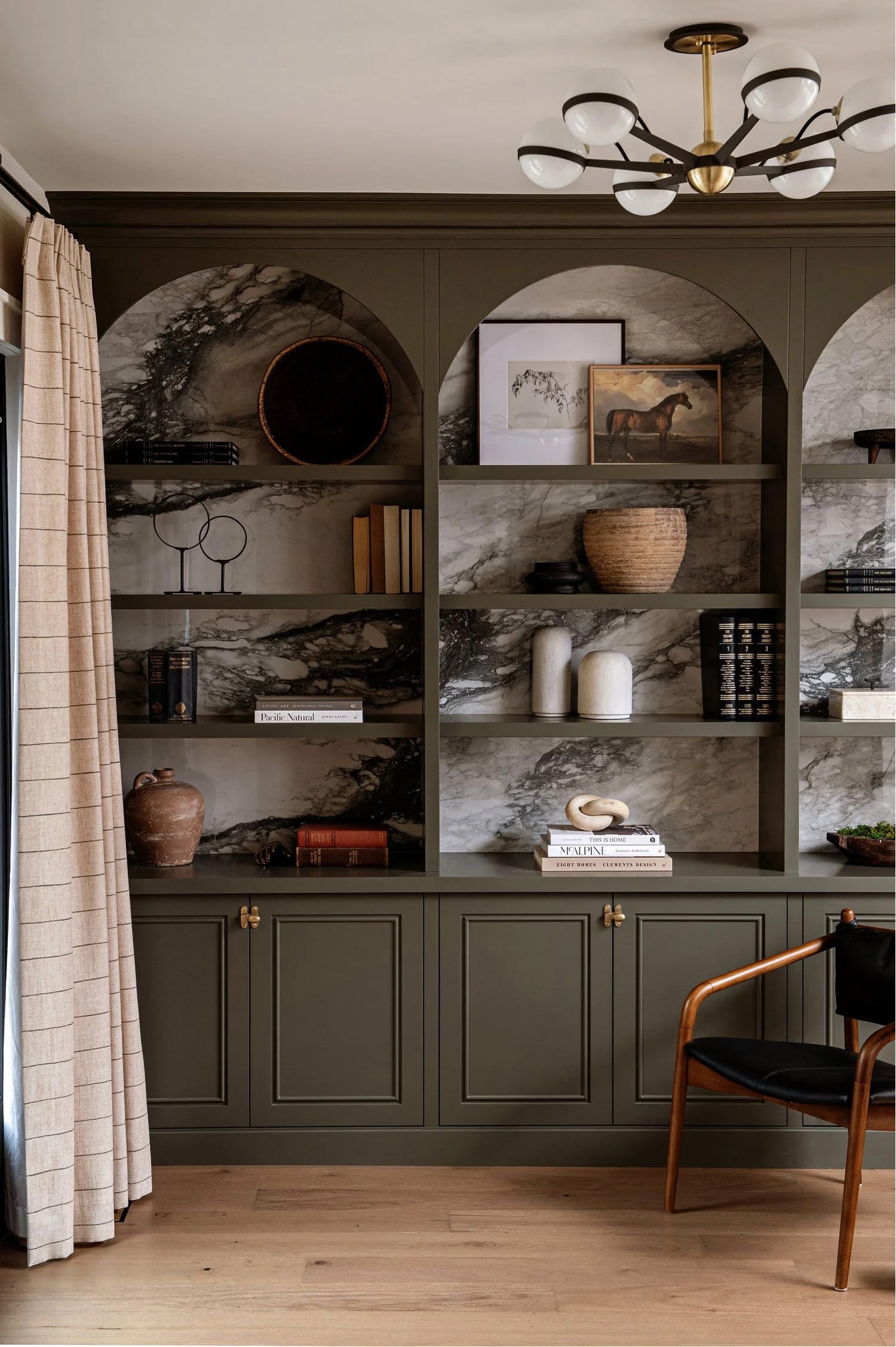
Open Shelving in Built-In Olive Green Cabinets
Image courtesy of KBD Interiors.
6. Add Metallic Railing to Open Shelving
Shelf railing is one of the most overlooked finishing details in open shelving design — and one of the most impactful. A brass or black metal rail added to the front edge of a shelf introduces a refined, architectural quality that elevates even the simplest display, and it provides the practical benefit of preventing objects from sliding forward without the visual heaviness of a solid front.
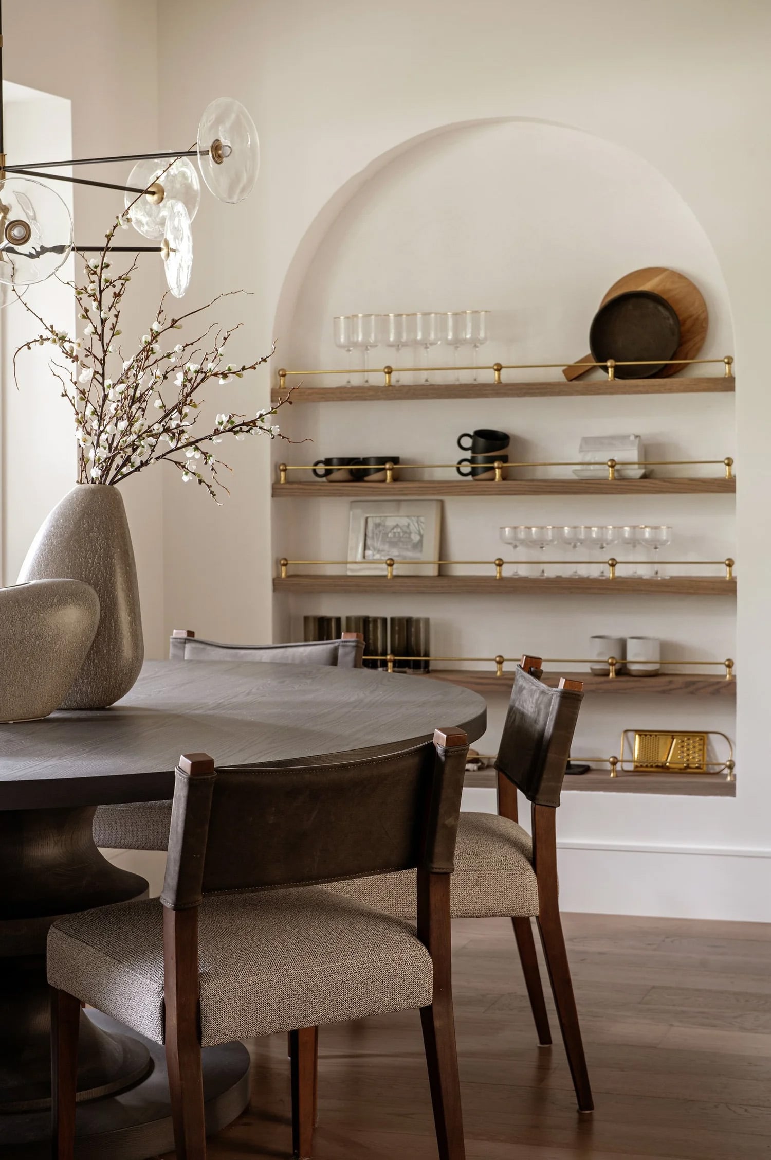
These two dining rooms show brass railing used in completely different contexts to equally strong effect. The first features a built-in cabinet with an arched surround — light oak base cabinetry with bar fridges below, white shelving above against a dramatic black glossy subway tile backdrop, and brass railing on each shelf front. The combination of the dark tile backdrop and the warm brass rail creates a high-contrast display that suits the black woven leather dining chairs and warm wood table throughout the room. The second takes a lighter approach — a white arched alcove with wood shelving, white backdrop, and brass railing displaying wine glasses, coffee mugs, wood cutting boards, brass sculptures, and artwork. The brass rail is the single metallic element that gives the otherwise simple display its refined, considered finish.
Designer Tip: I recommend brass railing as the first upgrade to consider on any open shelving project — it costs relatively little compared to the overall shelving investment but adds a level of finish and intentionality that immediately reads as high-end. Black metal railing suits darker, more contemporary palettes; brass suits warm, organic, and transitional interiors.
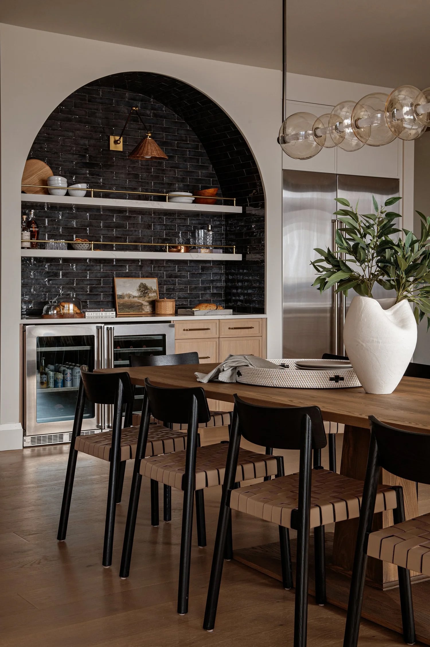
Brass Railing on Open Shelving
Images courtesy of KBD Interiors.
7. LED Lighting on Open Shelving
Lighting transforms open shelving more dramatically than any single styling decision — a well-lit shelf at night becomes the room’s focal point regardless of what’s on it, while an unlit shelf recedes into the wall even when beautifully styled. LED strip lighting installed along the underside or back edge of each shelf adds the warm ambient glow that activates the display after dark and reveals the texture of the backdrop material in a way that ambient room lighting never achieves.
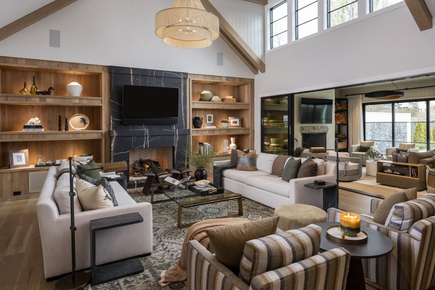
This modern rustic living room shows shelf lighting used to extraordinary effect. Built-in wood cabinets with thick wood shelving flank a black marble fireplace with white veining — the shelving backdrop of warm wood paneling illuminated by LED strips that cast a warm glow across the grain and texture of the wood behind the display. The result is a room-defining focal point that anchors the entire living space — white furniture with forest green, brown, gray, and black accents throughout the room all drawing the eye back to the glowing shelving composition. The styling itself is deliberately restrained — sculptures, pottery, vases, candles, and artwork placed with breathing room — allowing the lit backdrop to do the atmospheric work rather than the objects.
Designer Tip: I’m currently incorporating LED underlighting into my own feature wall shelving project for exactly this reason — the sculpted wave edge profile of the shelves will be activated by the warm LED glow underneath each shelf, creating a detail that reads as purely decorative at night but disappears entirely in daylight. I always specify warm white LED strips rather than cool white for shelving applications — the warm tone flatters wood, ceramic, and organic materials in a way that cool white never does.
Open Wood Shelving with LED Lighting
Image courtesy of JFY Interiors
8. Combine Open Shelving with Glass-Front Cabinetry
One of the most sophisticated approaches to kitchen and living room storage is combining open shelving with glass-front cabinetry rather than choosing one or the other — the combination creates visual rhythm across the wall, allows some objects to be fully displayed while others are softened behind glass, and adds the architectural layering that a single shelving type alone rarely achieves.
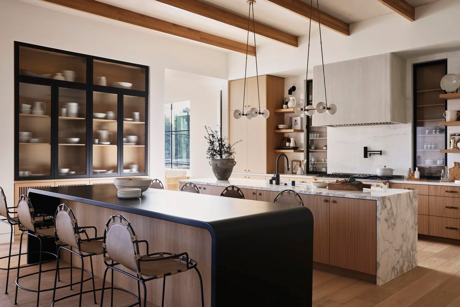
This kitchen shows the combination executed with genuine material sophistication. Light oak upper cabinets, open wood shelving, and black-framed reeded glass cabinets with wood shelving and wood backdrops run along the wall behind the dual islands — the reeded glass adding texture and a soft filtering quality that makes the displayed objects visible without fully exposing them. A second large built-in cabinet with the same black-framed reeded glass houses an artful arrangement of stoneware pots, vases, jugs, and bowls — the sculptural quality of the ceramics reading beautifully through the reeded glass surface. LED lighting inside the glass cabinets activates the display after dark, the warm glow catching the texture of both the reeded glass and the wood backdrop simultaneously. A white plaster fluted range hood, ceiling beams, dual waterfall-edge islands, and leather stools complete the layered material palette of black, white, and warm wood throughout.
Designer Tip: I recommend reeded or fluted glass over clear glass for cabinet fronts in a display application — the texture of the glass softens and filters what’s behind it, so objects don’t need to be styled with the same precision as fully open shelving. It’s a more forgiving display format that still reads as considered and high-end, and the glass texture itself adds a decorative quality that plain glass never achieves.
Open Wood Shelving with LED Lighting
Image courtesy of JFY Interiors
9. Let Your Shelves Tell a Story
The most memorable shelf displays are the ones that couldn’t belong to anyone else — the accumulated objects of a specific life rather than a curated selection of decorative pieces. Mementos from travel, inherited objects, handmade pieces, family photographs, and collections built over years add the personal depth that no amount of perfectly chosen vases and sculptures can replicate.
This light oak built-in cabinet shows exactly what a collected, personal display looks like at its best. Rustic brass bells, antique wood boxes, wood sculptures, geometric sculptures, family photos in frames, books, vases, and storage boxes for photographs layer across the shelves in a composition that reads as genuinely accumulated over time rather than assembled in an afternoon. Old pieces sit alongside new ones — the contrast between patinated antique objects and cleaner contemporary pieces creating the visual tension that makes the display feel alive rather than static.
Designer Tip: I recommend weaving personal objects throughout a shelf display — the more a shelf reflects a specific life and history, the more compelling it becomes. I purchase objects every time we travel specifically for our shelves at home — a large leather-wrapped vase from Costa Rica, a stone vase from Patagonia, books, candles, and interesting found stones that would mean nothing to anyone else but tell the story of where we’ve been. That accumulated, well-traveled quality is impossible to replicate with a single shopping trip, and it’s exactly what makes a shelf display feel genuinely personal rather than decorated.

Open Wood Shelving with Vases, Artwork, Plants, Sculptures & Wicker Baskets
Image courtesy of Studio McGee
10. Use Vertical Dividers to Create Structure Within Open Shelving
Uninterrupted open shelving across a wide wall can feel visually overwhelming — too much open space with no internal structure for the eye to follow. Vertical dividers built into the shelving architecture solve this problem by breaking the display into distinct sections, each of which can be styled independently while contributing to the overall composition.
This built-in dark wood cabinetry shows the technique used with real architectural confidence. Vertical wood slabs divide the shelving into a rectangular center section flanked by two square sections on either side — the geometry creating a defined framework that makes the display feel considered before a single object is placed. Each section houses earth-tone sculptures and pottery styled within its own contained space, creating distinct visual moments that read as a cohesive whole when viewed from across the room. The high contrast of dark wood cabinetry against white walls behind, light oak flooring, and a black sculptural vase filled with leafy greens adds the depth and drama that makes the whole composition genuinely dynamic.
Designer Tip: I recommend specifying vertical dividers in any open shelving installation wider than 120cm — without internal structure, wide open shelving tends to look underdressed regardless of how many objects are placed on it. The dividers do the architectural work that styling alone cannot, and they create the contained sections that make object grouping more intuitive and visually satisfying.

Creating Visual Interest
Image courtesy of Brittany Hakimfar Design
11. Secure Artwork to the Shelf Divider Rather Than the Wall
Hanging artwork directly on the wall beside shelving is the conventional approach — but securing it to the vertical divider between shelf sections creates a more integrated, layered composition where the artwork becomes part of the shelving display rather than a separate decorating moment on an adjacent wall.
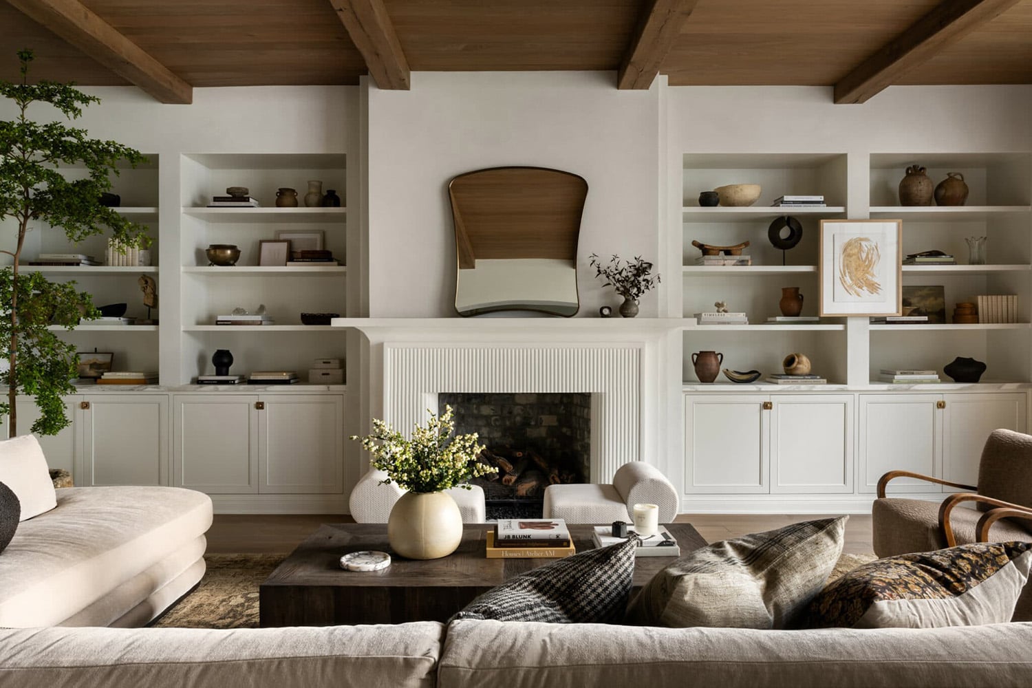
This living room shows the technique used to strong effect. White open cabinetry flanks a white fluted fireplace surround with a mirror above — four built-in shelf openings in total, two on each side of the fireplace, divided by vertical wall dividers. Sculptural and organic objects in warm earth tones and metallics fill the shelves throughout, while artwork secured directly to the front surface of a divider between the two cabinet sections on one side creates a layered, gallery-quality moment within the shelving composition. The warm wood flooring, wood ceiling and beams, and large white velvet sofa facing the feature wall complete the composition — the shelving display is the room’s clear focal point.
Designer Tip: I recommend securing artwork to shelf dividers or the back wall of deep shelving rather than always defaulting to hanging it above or beside — artwork integrated into a shelf display creates a collected, layered quality that artwork hung independently on adjacent walls rarely achieves. Leaning smaller framed pieces against the back wall of a shelf rather than hanging them is the simplest version of this approach and requires no installation at all.
Artwork Secured to the Front of Open Shelving
Image courtesy of Studio McGee
12. Styling Open Shelving in the Kitchen
Kitchen open shelving requires a different balance than living room or bedroom shelving — the functional objects of a working kitchen (stoneware, cookbooks, glassware, cutting boards) need to coexist with the decorative ones, and the styling has to hold up under the practical demands of a space that’s used daily. The most successful kitchen shelving displays treat functional objects as decorative ones — choosing stoneware, wood bowls, and wicker baskets that are genuinely beautiful in their own right rather than hiding the practical and displaying only the decorative.
This kitchen shows that balance across two distinct shelving moments. Open wood shelving on either side of the range hood — framed by windows and set against a seamless white marble backsplash with warm veining that runs from countertop to ceiling — displays artwork and vases with the same considered approach as a living room shelf. The fluted dark wood island below carries the practical shelving — trays, stoneware, wood bowls, and wicker baskets on open shelving within the island base — styled with the same material palette as the upper shelves. Cream lower cabinets with brass hardware and light oak flooring complete the warm, layered material story throughout.
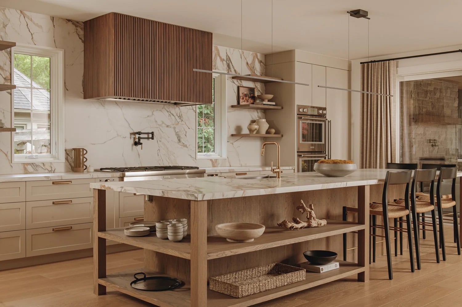
Open Shelving on the Kitchen Wall and Under the Island
Image courtesy of KBD Interiors.
The second approach takes a more architectural direction — in this kitchen with black cabinets and dramatic black and white marble countertops and backsplash, a marble ledge at the top of the backsplash acts as an open shelf that is used exclusively for display rather than function. Contemporary art and sculptures occupy the space — leaning artwork on the shelf itself, stone sculptures, a copper pot, and contemporary artwork above — treating the kitchen backsplash as a gallery wall extension rather than a purely functional surface. The marble ledge serves as the transition between the working kitchen and the considered art display.
Designer Tip: I recommend identifying at least one surface in a kitchen — a marble ledge, a floating shelf above the backsplash, or the top of an island — that is reserved exclusively for display rather than function. Mixing purely decorative objects into a functional kitchen space significantly elevates the room’s design quality and prevents the kitchen from feeling like it exists solely to serve a practical purpose.

Open Shelving in the Kitchen
Image Courtesy of Donna Mondi Design
13. Layering Earth Tones Around a Stone Fireplace
Amber Lewis grounds this living room in warmth: wheat-toned linen curtains filter soft light against creamy white walls, while a stone fireplace surround — framing, not reaching, the ceiling — anchors the room beneath a medium wood-framed mirror. Antique brass sconces sit above narrow built-in cabinets on either side, light oak throughout, closed storage below and open shelving above.
The shelves themselves carry books, lamps, vases, and artwork in the same earth tones as the room — a direct extension of the palette set by the Loloi Billie Rug in Tobacco/Rust, whose vintage-inspired, timeworn hues give the whole space its richly saturated, grounding character. A brown-and-cream striped sofa, a brown velvet wingback chair, and two wood accent chairs in neutral upholstery echo that same rug-driven palette, while a wood coffee table styled with black rustic pots — one holding a plant — adds the room’s only real material contrast.
Designer Tip: I recommend choosing one saturated anchor piece — a rug, a key piece of art, an upholstery fabric — and pulling your entire shelf palette directly from it, rather than assembling shelf colors independently and hoping they coordinate with the room. Here, the rug’s tobacco and rust tones show up everywhere, from the sofa stripe to the shelf styling itself, because everything was chosen to answer to that one piece.
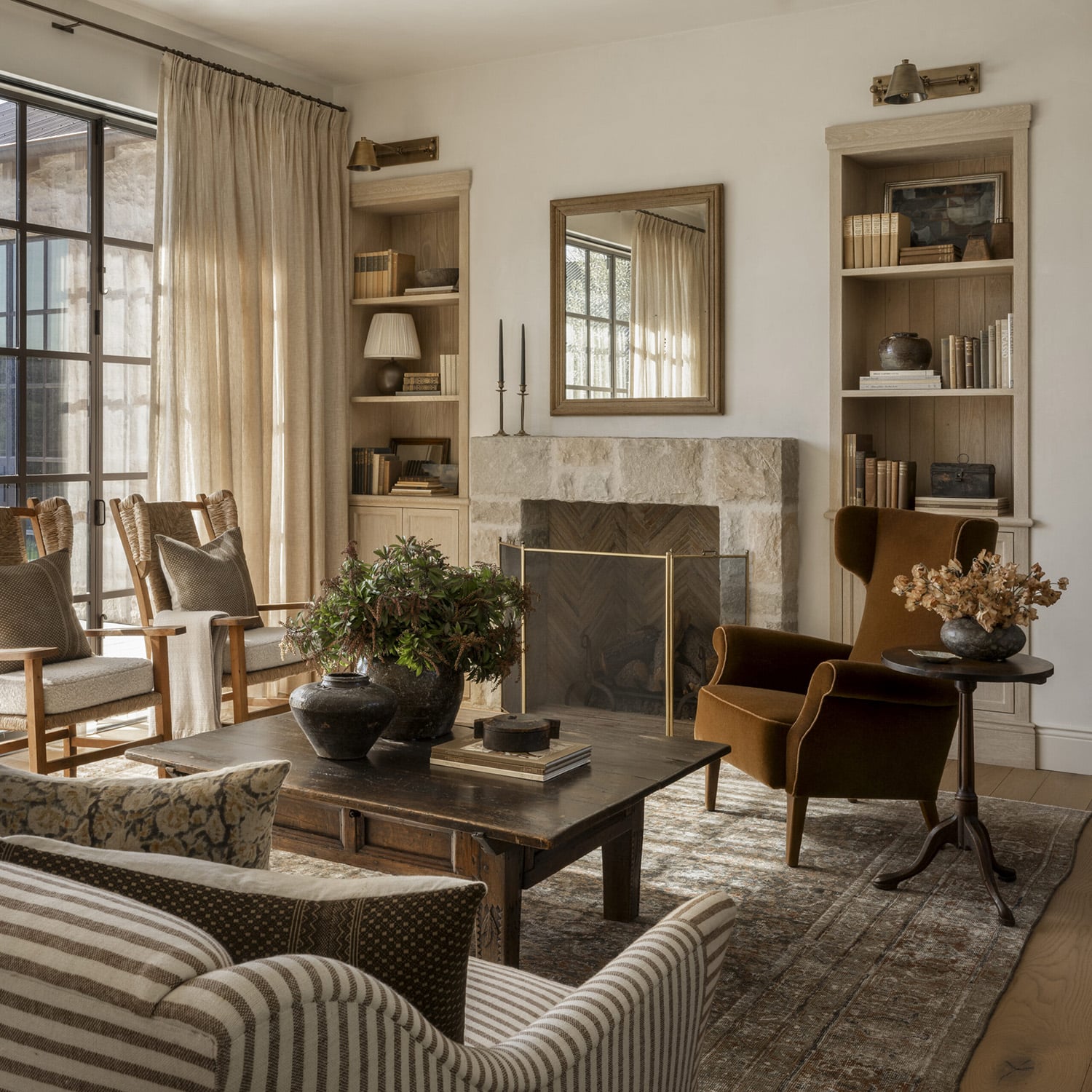
A Stone Fireplace Anchors Built-In Shelving in Warm Earth Tones
Image courtesy of Amber Interiors
14. Shelf Styling in the Home Office
Home office shelving serves a dual purpose that no other room requires — it needs to function as genuine working storage while reading as a considered design statement in a space that’s increasingly visible on video calls and in photographs. The styling approach should balance books and working reference materials with decorative objects, keeping the display organized enough to feel professional and personal enough to feel inhabited.
This home office shows shelving integrated into a richly designed room with genuine confidence. Forest green built-in lower cabinets with open shelving above sit against forest green walls — the shelving and wall sharing the same color creates the built-in, architectural quality that makes the shelving feel like part of the room’s structure rather than furniture placed against it. Books, artwork, vases, bowls, and a rustic pot with leafy branches fill the shelves in warm earth tones that connect to the dark wood desk, leather chair, large earth-tone area rug, and warm wood flooring, with a peaked ceiling and beams throughout. Brass hardware on the cabinetry, a brass chandelier, brass curtain rod, and brass desk lamp run the same warm metallic accent consistently from ceiling to floor — the material repetition creating the cohesion that makes the room feel genuinely designed. Floor-to-ceiling warm tan curtains soften the perimeter and prevent the deep green from feeling too enclosed.
Designer Tip: I recommend painting built-in home office cabinetry the same color as the surrounding walls rather than a contrasting tone — the shelving recedes into the architecture and the room feels larger and more considered than it would with cabinetry that reads as a separate piece of furniture. It’s one of the most effective and least expensive ways to make builder-grade built-ins feel custom.
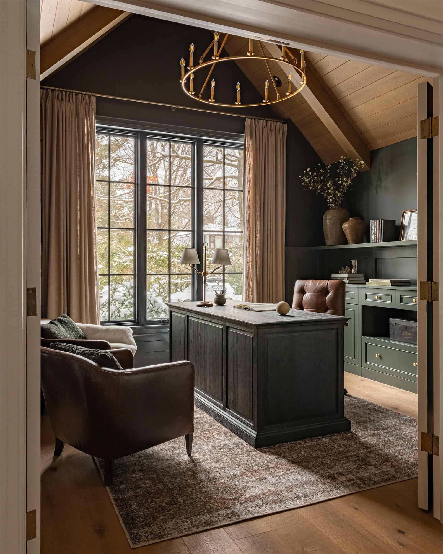
Open Shelving in a Home Office
Image courtesy of West of Main Design
15. Open Shelving in the Bedroom
Bedroom shelving serves a different purpose than any other room — the display should feel personal and restful rather than stimulating, and the objects chosen should contribute to the calm, considered atmosphere that a bedroom requires above all else. Built-in shelving flanking a bedroom fireplace is one of the most effective configurations, creating a symmetrical focal wall that anchors the room with genuine architectural presence.
This primary bedroom shows the approach at its most resolved. A wood paneled accent wall across from the bed houses a simple white fireplace surround with artwork above, flanked by two built-in cabinets with the same wood paneling continuing into the cabinet backs — the material continuity between wall and shelving making the whole composition feel like a single architectural element rather than cabinetry placed against a wall. Open wood shelves display artwork, pottery, books, and sculptures in warm earth tones that connect to the layered bedding, wood ceiling beams, and high peaked ceiling throughout. Black-framed patio slider doors to an outdoor seating area introduce the high-contrast note that prevents the warm wood palette from feeling too uniform.
Designer Tip: I recommend limiting bedroom shelf displays to a maximum of three object types — artwork, a plant or botanical element, and one category of decorative objects, such as pottery or sculpture. The restraint keeps the bedroom feeling restful rather than visually demanding, which is the quality a bedroom should prioritize above all others.
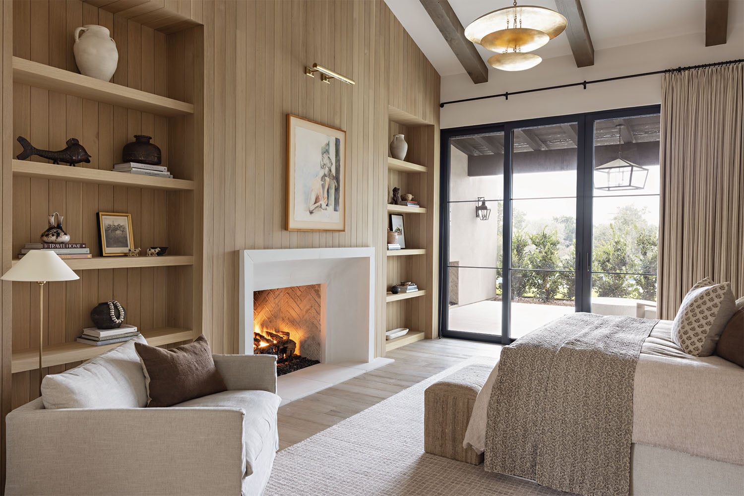
Open Shelving in a Primary Bedroom
Image courtesy of Intimate Living Interiors
16. Create a Gallery Wall on Your Shelves
The conventional shelf display mixes objects, plants, books, and decorative pieces across every surface — but one of the most striking alternatives is to abandon the mixed approach entirely and use shelving exclusively as a gallery system for artwork. The result is cleaner, more deliberate, and often more impactful than a mixed display precisely because the singular focus creates immediate visual clarity.
These three long floating shelves between two windows show the approach at its most confident. Layered black-framed photographs with white mats in varying sizes fill all three shelves — an eclectic mix of black and white photography arranged across the horizontal surfaces in the same way a gallery would arrange pieces on a wall. The varying sizes create the hierarchy and movement that a uniform grid of identical frames never achieves, while the consistent black frame and white mat across every piece provides the cohesion that allows the eclectic mix of images to read as a considered collection rather than an assortment.
Designer Tip: I recommend the leaning and layering approach for artwork on shelves rather than hanging each piece individually — overlapping frames at different depths creates the gallery quality that wall-hung artwork in a straight line rarely achieves. The front-to-back layering adds dimension that a flat arrangement on a wall simply cannot replicate.

Open Shelving with Layered Artwork
Image courtesy of Jenn Feldman Design
17. Edit Ruthlessly – Start with a Blank Shelf
The most common shelf styling mistake is adding objects to an existing arrangement rather than starting from nothing. Removing everything from the shelves before restyling forces a more deliberate selection process — every object that goes back earns its place rather than staying because it was already there.
This eclectic modern home office shows what deliberate editing produces. Olive green built-in cabinetry with vertical dividers in the open upper section frames a display of modern art, black and white sculptural objects, wood boxes, and vases — each piece occupying its section with genuine intention and breathing room between pieces. The sophisticated result comes not from adding more but from adding only what belongs: a sculptural black desk, caramel leather stools, a brass task lamp, and a black and white area rug establishing the room’s material palette, which the shelving display simply continues. Viewed through the black-framed glass doors from outside the room, the whole composition reads as a single considered interior rather than a decorated office.
Designer Tip: I recommend emptying shelves completely every six to twelve months and restyling from scratch rather than simply rearranging existing objects. The process of removing everything forces you to reassess each piece individually — and inevitably some objects that felt essential when surrounded by others reveal themselves as unnecessary when considered alone. The edit is where the real styling happens.
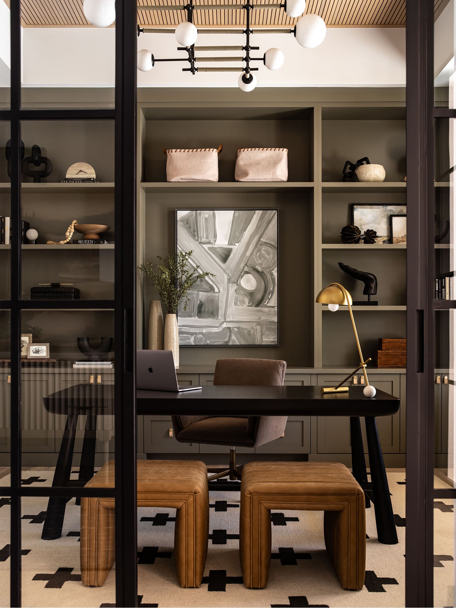
Home Office with Olive Green Open Shelving
Image courtesy of Alisha Taylor
18. Use Sculptural Objects as the Primary Shelf Element
The conventional shelf display relies on a mix of books, plants, vases, and framed artwork to create visual interest — but a more distinctive approach is to let sculptural objects carry the entire display, using pieces with genuine three-dimensional presence and artistic quality rather than decorative fillers.
This modern living room shows sculptural objects used as the primary shelf element with real confidence. Open shelving flanking a white fluted fireplace surround — with textured wood-toned wallpaper as a warm backdrop — is styled almost exclusively with pieces chosen for their sculptural quality: unique sculptures, sculptural bookends, and organic-shaped bowls in metallic, black, white, and wood tones. Framed artwork and photography provide the two-dimensional counterpoint that gives the sculptural pieces their context, but the objects themselves are doing the primary visual work. The black leather sofa, modern white textured accent chairs, and large brown leather coffee table throughout the room establish the high-contrast modern eclectic palette that the shelf display simply continues.
Designer Tip: I recommend investing in two or three genuinely sculptural pieces for any shelf display — objects with distinctive three-dimensional form that would read as interesting from any angle, not just from the front. A well-chosen sculptural piece does more visual work than a dozen conventional decorative accessories, and it gives the display a quality that reads as genuinely considered rather than assembled from a home decor store.

Choosing a Design Theme
Image Courtesy of Donna Mondi Design
19. Scaling a Display: From Formal Dining Room to Playroom
Amber Lewis applies the same large-medium-small logic to two completely different rooms. In the dining room, a vaulted white ceiling with an exposed beam holds a sculptural brass chandelier, while black-framed glass cabinets flank a stone fireplace beneath a large abstract artwork. Each cabinet leads with its largest pieces — substantial pottery and vases — then layers down through books and bowls to smaller objects at the front, with real breathing room between pieces rather than a shelf packed edge to edge.
In the children’s room, gray built-in shelving runs the length of a sloped ceiling, accessed by a brass-railed library ladder. The same sizing principle governs an entirely different set of objects: a model sailboat and stacked jars anchor as the largest pieces, framed art and books fill the middle scale, and small toys and pet portraits sit at the front. Two teal poufs on the rug below echo the shelving’s playful, collected feel.
Designer Tip: I recommend placing your largest objects on the shelf first, before anything else — they set the visual anchor points, and everything medium and small gets layered in around them afterward. Working the opposite way, starting with small objects and adding size later, almost always results in a display that needs to be completely rearranged once the larger pieces go in.


The Same Scaling Principle, Two Completely Different Rooms
Images courtesy of Amber Interiors
20. Balance Across Two Shelving Moments
Kristine Metcalf, lead stylist at Studio McGee, styles built-ins one side at a time, then steps back: “I want them to complete each other but also be able to stand on their own. It’s all about balance.” Pure Salt Interiors applies exactly that discipline in this modern farmhouse living room, where two matching archways flank a white fireplace with a charcoal herringbone interior and a mounted TV above.
Each archway repeats the same materials — a softly textured neutral wallpaper backdrop, gray-toned wood shelving and countertop, closed white cabinetry below — but the objects on each side aren’t identical. Rustic pots, vases, artwork, plants, sculptural pieces, and wicker baskets vary from side to side, close enough in material and tone to read as one composition, different enough that neither shelf feels like a mirror image of the other.
Designer Tip: I recommend styling symmetrical built-ins one side at a time, completing each fully before comparing them — rather than placing one object on the left, then its “match” on the right. Working side by side too closely tends to produce a display that’s identical rather than balanced, and identical rarely reads as intentional the way a considered near-match does.


Two Matching Archways, Each Styled to Stand Alone
Images courtesy of Pure Salt Interiors
21. The Rule of Three, Applied to a Working Dining Cabinet
Jean Stoffer builds this full-wall cabinet around a soft blue-gray tone, grounded by rustic wide-plank flooring and a wood countertop that echoes the same warm red-orange tones underfoot. At the center, two open-shelved sections form a coffee bar — an espresso machine, mugs, artwork, and plants arranged beneath a pair of brass wall sconces — flanked on either side by glass-front cabinets holding plates, dishware, cups, and serving ware, all in white.
Odd-numbered groupings do real work in the coffee bar section specifically: objects clustered in threes, at varied heights, read as considered rather than symmetrical in a way that a matched pair never quite achieves. The glass-front sections on either side stay more uniform by necessity — dishware needs to stack and organize functionally — but the open coffee bar at the center is where the styling gets to breathe.
Designer Tip: I recommend reserving odd-numbered, varied-height grouping specifically for a cabinet’s open, non-functional sections — like this coffee bar — rather than trying to apply it everywhere. A closed or glass-front storage section governed by function (stacking plates, organizing glassware) doesn’t need the same visual rule; forcing it there usually just makes practical storage harder to use.


A Coffee Bar Anchors a Full-Wall Blue-Gray Built-In
Image courtesy of Jean Stoffer Design
22. Three Shelves, Each Anchored and Staggered
Kate Marker’s open shelving shows the staggering principle across three distinct levels. On the countertop, two round white ceramic canisters with wood lids stack in a small large-to-medium pair, alongside a geometric-patterned pot holding leafy branches and a woven basket with leather handles — none of the pieces directly adjacent to another of the same shape or height.
The middle shelf holds a gold-framed floral still life, a stone dish paired with two round wooden orbs, three designer bottles styled on a wood tray, and a wider canister echoing the one below it — positioned to avoid sitting directly above its match. On top, a wooden vase, a woven basket propped against the back wall, an antique butterfly print, and a vintage clock round out the display, each piece given its own visual space rather than crowding the shelf’s edge.
Designer Tip: I recommend styling all of one object type across every shelf before moving to the next — place every vase first, then every basket, then every piece of art — rather than completing one shelf fully before starting the next. Working this way makes it much easier to see when two similar objects have landed too close together or directly above one another, which is the staggering principle in practice, not just in theory.

Three Shelves, Each Staggered to Avoid Stacking or Crowding
Image Courtesy of Kate Marker Interiors
23. A Monochromatic Navy Built-In
Whittney Parkinson commits fully to one color here: the accent wall, the shelving, and the backdrop behind it are all the same rich navy blue, broken only by a white marble fireplace surround and two matching abstract artworks in white hung side by side above it. Dark wood flooring keeps the room from feeling cold despite how saturated the color is.
Two built-in cabinets flank the fireplace, lit by linear brass sconces above. Wooden bowls, a mounted horn, artwork, books, vases, and bookends fill the shelves in warm, varied materials — every object reading with real clarity against the uniform dark backdrop, since nothing has to compete with a busy or textured wall.
Designer Tip: I recommend a fully monochromatic wall-to-shelving treatment, like this navy, specifically when you want your objects to be the entire visual story — a single saturated color removes any competition between backdrop and display, so even simple, unfussy pieces like wooden bowls and books read as intentional rather than getting lost.

A Monochromatic Navy Wall Makes Every Object Read Clearly
Image Courtesy of Whittney Parkinson
24. A Controlled Palette, Deliberately Narrow
Mindy Gayer builds this modern farmhouse living room around restraint: light wood vertical paneling runs from the white marble fireplace surround straight through to the back of the built-in shelving, tying the whole wall together as one material gesture. Light oak ceiling beams echo the same wood tone overhead, while a natural linen sectional — layered with a striped throw and mixed neutral pillows — keeps the seating area equally quiet.
The shelving itself, asymmetrical in width on either side of the fireplace, stays within a tightly controlled palette: white vases and sculptural objects, wicker baskets, wood candlesticks, and wood-framed artwork, all variations on white, wicker, and light wood with nothing outside that range. Black wall sconces above each section repeat the same dark note struck by the fireplace insert and the mounted TV — three black elements at different heights, giving the pale room just enough contrast to keep it from reading as flat.
Designer Tip: In a room this pale and quiet, limiting the shelf palette to just two or three materials — here, white ceramic, wicker, and light wood — is what keeps the display from disappearing into the wall behind it. A narrower palette isn’t always the right call, but it’s the right one whenever the surrounding room is already this restrained; anything more varied on the shelves would compete with the paneling and beams rather than complement them.

Black Accents at Three Heights Anchor an Otherwise Pale Palette
Image courtesy of Mindy Gayer
25. Building an Eclectic, Collected Display
Four white floating shelves hold what reads as decades of collecting rather than a single shopping trip: patinated wood bowls in varying tones and shapes on the top shelf, terracotta and glazed ceramic urns and jugs below, then a shelf mixing carved wood plates, small stone vessels, a wood mask, and tiny figural sculptures on stands, finished with a bottom shelf of stacked bowls, a large wood tray, and more ceramic vessels in muted greens and grays. Nothing on any shelf matches its neighbor exactly — the unity comes from material, not repetition.
Below the shelving, a cluster of black wood stools does double duty as extra display surface rather than seating, extending the collected feeling down to the floor. A large terracotta urn planted with olive branches sits beside a boucle armchair, echoing the shelving’s ceramic vessels at a much larger scale.
Designer Tip: I recommend using furniture — a stool, a low bench, a stack of vintage boxes — as an extension of a shelf display rather than confining objects to the shelves themselves. Here, the stools beneath the shelving continue the same material story down to the floor, making a genuinely dense, eclectic collection feel intentional rather than overwhelming.

Four Shelves of Collected Wood and Ceramic Vessels
Images courtesy of Brittany Hakimfar Design
26. How Full Should a Shelf Be?
Lindye Galloway’s home office answers the density question with real restraint: three floating wood shelves hold an eclectic mix of black and white vases, stone objects, sculptural candle holders, artwork, and stone bookends — genuinely varied pieces, but with real negative space between each one. Below, a light oak desk with a black metal base and chocolate leather seating sits opposite two white bouclé swivel chairs, with warm wood cabinetry and black hardware carrying the same tight black-white-wood palette from floor to shelf.
The shelves read as curated rather than crowded because roughly half of each shelf’s surface stays empty. Every object has room to be seen individually, even in a display with this much variety in shape and material.
Designer Tip: I recommend filling no more than half to two-thirds of any shelf’s surface with objects, regardless of how many pieces you’re working with. A shelf styled to its absolute edges reads as cluttered no matter how good the individual objects are — the empty space is doing as much visual work as anything you place on it.

Three Floating Shelves, Roughly Half Left Empty in a Home Office
Image courtesy of Lindye Galloway Design
27. The Triangle Rule, Shown Two Ways
Studio McGee’s built-in shows the triangle principle at shelf-by-shelf scale: on one level, a framed black-and-white photograph and a stacked-books-with-carved-stone object sit at the back, with two ring-shaped wood sculptures on stands positioned slightly forward and to the side. Below, a wide wood bowl sits toward the front of an otherwise empty shelf, giving the display room to breathe between levels. A cream ceramic urn with sculptural handles tops the unit alone, its height doing the work of an entire shelf.
reDesign Home applies the same layering logic across a full wall of built-ins in this home office. Each section stacks smaller objects — books, a globe, small vases, trophies — toward the front and sides, while taller elements like two framed horse paintings and stacked leather-bound books anchor the back of the central alcove. A dark wood desk with iron legs sits in front of the whole composition, its leather chair and brass accessories echoing the built-ins’ warm tones.
Designer Tip: I recommend applying the triangle rule at more than one scale simultaneously, the way both these spaces do — tallest objects at the back of each individual shelf, but also the tallest overall pieces (art, lamps, larger vessels) positioned toward the back of the room as a whole. The same front-to-back logic that organizes one shelf can organize an entire wall of built-ins.

Open Wood Shelving with a Well-Balanced Display
Image Courtesy of Studio McGee

Open Shelving in a Regal Home Office
Image Courtesy of reDesign Home
28. The One-Third Rule: Books, Accessories, Empty Space
Vernich Interiors’ built-ins, flanking a stone fireplace beneath a black-and-white abstract painting, show the one-third ratio in practice: roughly a third of each shelf holds books, a third holds accessories — vases, ceramic sculptures, a small woven bag, stacked frames — and a third stays genuinely empty. Vertical shiplap paneling behind the shelving keeps the backdrop quiet, while a wrought iron chandelier and white boucle armchairs carry the same warm, textural palette into the seating area.
Designer Tip: I recommend weighing your shelf’s load if you’re storing anything beyond light decorative objects — a general rule of thumb is 25-30 pounds per linear foot of shelf space. A shelf that looks perfectly styled but is quietly overloaded will eventually sag or fail, which is a functional problem no amount of good styling can fix.

Roughly a Third Books, a Third Accessories, a Third Empty Shelf
Image courtesy of Caroline Sharpnack Photography (Vernich Interiors)
29. An Asymmetrical Grid, Styled Like a Gallery
This built-in doesn’t repeat a single module — deep and shallow openings, wide and narrow sections, some stacked two-high, others left as one tall space, all built around a central media wall. That irregularity is the point: with no matching pairs to fill, every opening gets treated as its own small gallery, holding just one or two objects rather than a grouped display.
A graphic black-and-white line drawing, a black disc sculpture, ceramic vessels in warm and cool tones, and a scattering of small carved objects each occupy their own cell, with real wall space visible around every piece. Below, closed cabinetry in the same natural oak keeps the composition grounded, while boucle ottomans and a white sculptural sofa in the foreground echo the shelving’s restrained, sculptural quality.
Designer Tip: I recommend styling irregular or asymmetrical shelving with exactly one or two objects per opening, never more — matching, symmetrical built-ins can carry grouped displays, but an asymmetrical grid like this one reads as chaotic if every cell is filled with multiple pieces. Let the architecture’s own irregularity be the visual interest, and keep the objects simple.

Irregular Shelf Openings, Each Styled as Its Own Small Gallery
Images courtesy of Brittany Hakimfar Design
30. An Antique Console as Open Shelving
Carole Estes Design pairs a heavily worn, chippy-paint antique console with a gallery wall of black-and-white sketches and drawings in mismatched frames above it — unlike a shelf styled as a gallery, here the art stays on the wall while the open shelving below does separate, object-focused work. Black cast iron lamps with cream shades bookend the piece, their dark, sculptural bases echoing the ink drawings’ linework.
The console’s top surface holds brass candlesticks at staggered heights, a cluster of weathered terracotta jugs, and a stack of rustic stoneware plates, while the open shelf beneath is dense with wood and stone bowls, small ceramic vessels, and a stack of mismatched dishware — genuinely well-worn pieces that look collected over years, not staged for a single photograph. Nothing here is polished; the appeal is entirely in the age and wear of the piece itself.
Designer Tip: I recommend an antique or reclaimed piece with visible wear — like this console — whenever you want open shelving with real history built in, rather than a new piece styled to look aged. The chipped paint and worn wood do work that no amount of careful object curation can fake; they’re what make a display like this read as genuinely collected rather than assembled.

A Worn Antique Console Doubles as Open Shelving
Image courtesy of Carole Estes Design
Styling Your Shelves with Confidence
The principles in this guide — starting with the right shelving, considering the backdrop before the objects, building around a consistent palette, layering materials and personal pieces, applying the triangle rule and the one-third ratio, staggering substantial pieces rather than stacking them, grouping in odd numbers, and lighting the display deliberately — give you a framework that works regardless of your style, your budget, or the room you’re working in.
The best shelf displays I’ve seen share one quality: they feel specific to the people who live with them. The travel objects, the inherited pieces, the artwork collected over years — these are the details that transform a well-styled shelf into something genuinely irreplaceable. Start with the structure, apply the principles, and then trust the personal accumulation to do the rest.
I’ll update this post with photos of my own feature wall project — three live-edge shelves with LED underlighting beside our black fireplace — once the installation is complete this fall.
Frequently Asked Questions About Shelf Styling Ideas
What is the rule of three in shelf styling?
The rule of three means grouping objects in odd numbers — three, five, or seven — rather than even numbers, since odd-numbered groupings read as more visually dynamic and considered. Varying the heights within the group adds further interest.
What are the trending shelf styles?
Live-edge and sculpted-profile shelving is trending in modern organic and Scandinavian-influenced spaces, while built-in shelving with a painted-to-match backdrop remains popular for a more architectural, integrated look. LED underlighting is an increasingly common upgrade, activating a display after dark regardless of shelf style.
How can I decorate a shelf in a stylish way?
Start with the shelving itself, not the objects — the material and profile set the tone for everything you place on it. From there, layer at least three or four material types (ceramic, wood, natural fiber, a living plant), vary the height and scale of your pieces, and leave roughly a third of each shelf empty rather than filling it edge to edge.
How can I style open shelves in my home?
Assess the wall behind the shelving first — a neutral backdrop lets busier, more varied objects take center stage, while a patterned or textured wall calls for more restrained styling. Group similar objects in odd numbers, apply the triangle rule (tallest items at the back, smallest at the front), and repeat two or three objects elsewhere in the room to tie the shelving into the space as a whole.
How much weight can open shelving safely hold?
A general rule of thumb is 25-30 pounds per linear foot of shelf space. This matters most for heavier functional items like books or stoneware — a shelf that looks well-styled but is quietly overloaded will eventually sag or fail.
View Recent Posts
Stunning Range Hood Design Ideas
Range hood design ideas covering stone, wood, plaster, copper, and stainless steel — with designer tips on proportion, material selection, and installation.
Rustic Bedroom Ideas
Rustic bedroom ideas covering natural materials, layered textiles, color palettes, and professional design strategies for log cabin, modern rustic, Scandinavian, and luxury retreat styles.
Rustic Bathroom Ideas
Rustic bathroom ideas — natural materials, vintage fixtures, earthy palettes, and designer tips for log homes, cabins, and mountain retreats.
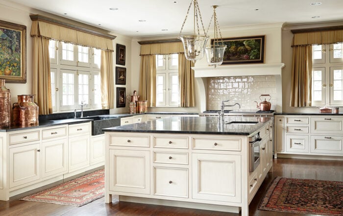
Cream Kitchen Cabinet Ideas
Cream kitchen cabinet ideas curated by interior designer Tracy Svendsen. Warmer than white and more versatile than beige, cream cabinets work beautifully across farmhouse, rustic, traditional, and modern kitchens.
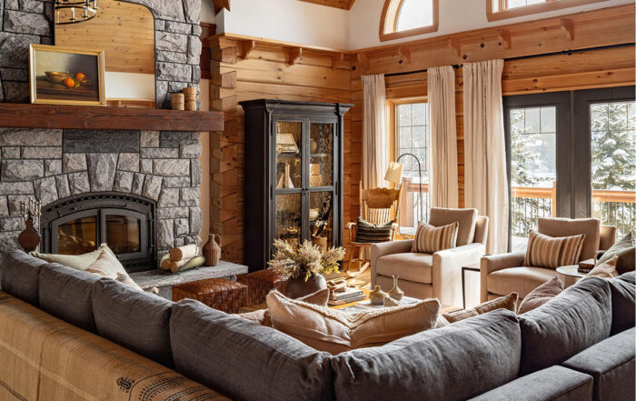
Log Home Decorating Ideas
Log home decorating ideas covering color palettes, furniture selection, lighting, stone fireplaces, and modern approaches to handcrafted log home interiors.
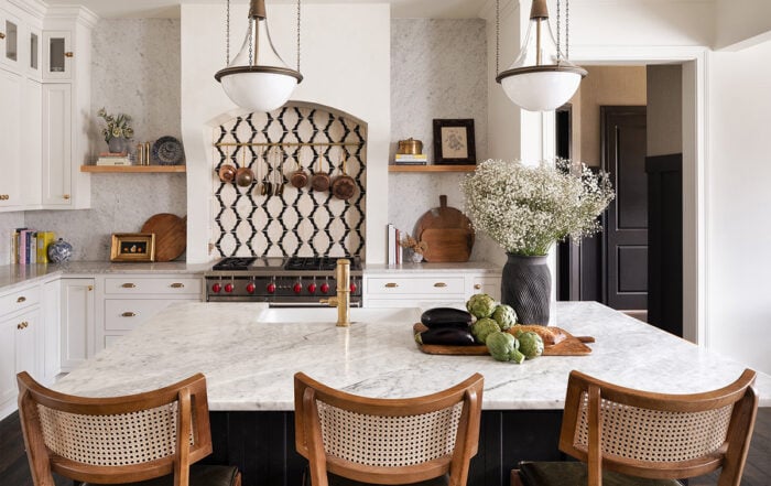
Country Kitchen Ideas
Discover 43 country kitchen ideas featuring warm earth tones, natural materials, vintage accents, and expert guidance on cabinets, colors, and styling for an authentic country kitchen design.

